Colorfall is Ian Davenport’s latest exhibition at Paul Kasmin Gallery, a cavalcade of hues that is quite refreshing. Davenport uses a syringe to “drip acrylic paint onto aluminum and stainless steel panels,” which allows gravity to create perfectly straight lines of color that end in brilliant explosions of heterogeneity.1 Perhaps it is nature’s integral role in the outcome of these paintings that imbues each piece with a level of comfort and familiarity; or, better yet, that these paintings are a beautiful product of nature and man, a union that has always been fraught with turmoil. In any event, Colorfall establishes itself as a reflection of the mind, and humankind’s relationship to the world.
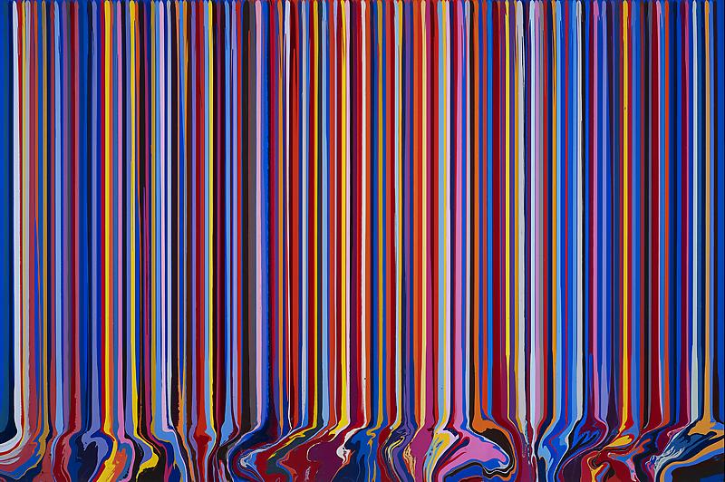
© Ian Davenport, Cobalt, Vermillion, Cobalt, 2013. Courtesy of Ian Davenport and Paul Kasmin Gallery, NYC.
Cobalt, Vermillion, Cobalt (as seen above) is emblematic of the exhibit at large: neat rows of variegated colors cascade inevitably down the steel panel, until they hit an invisible wall and envelope each other, a breakdown into chaos. At the very top of the painting, you can see tiny spaces in between the columns of color, which give away the work’s solid, piercing blue background. Each piece had this same basic format. However, a different background color was used for each painting, accompanied by a unique, hue-informed vibe; regardless of the myriad colors utilized, every work had its own presence, a phenomenon I believe was directly correlated to these disparate background colors.
Colorfall is a mirror for the human mind. Despite the prismatic assortment of colors, I still had the tendency to look for a pattern, some sort of repeating sequence that would “unlock” each piece’s meaning. Humankind has always strained to understand its physical surroundings, and in this endeavor, it has attempted to make order out of chaos. Davenport has not only captured this propensity for structure, but used it against the mind of the spectator.
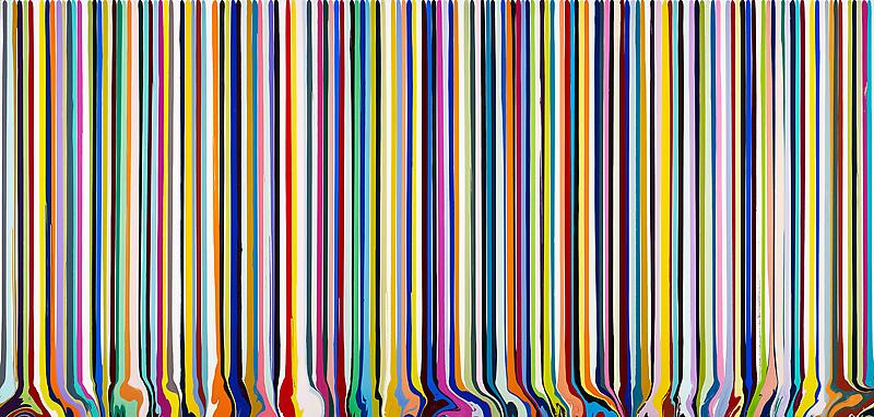
© Ian Davenport, Cutout, 2013. Courtesy of Ian Davenport and Paul Kasmin Gallery, NYC.
As I stared intently at a piece called, Cutout, I discovered a curious side effect of Davenport’s paintings: the images, like optical illusions, burn themselves into your mind, transforming the surrounding white walls into canvases of their own (these secondary phenomena appear to be the negatives of their originals). Colorfall therefore, is assured a lasting impression in viewers’ minds. Again, I believe these paintings are so relatable, because they appeal to a human need for expression itself. These strict, colorful lines, while providing three-dimensional depth to each piece, inevitably end in an eruptive release of some kind of frustrated energy. The will of separate individuals becoming the action of the collective.
There were two paintings in this exhibit that contradicted the rest. One of them (shown below) was Idanthrone, a painting that gave the impression of an upward climb, as opposed to a downward progression. Within Idanthrone lay a solemnity, a stark religious tone intensified by a darker background. In juxtaposition with say, Cutout or Cobalt, Vermillion, Cobalt, you can see just how powerful Davenport’s technique really is; the alternation of colors has, and always will be the messenger of meaning.

© Ian Davenport, Idanthrone, 2013. Courtesy of Ian Davenport and Paul Kasmin Gallery, NYC.
Review by Paul Longo
1Paul Kasmin Gallery press release for Ian Davenport’s Colorfall, 2013.