Pantone's 2018 Color of the Year: Ultra Violet
By Frances Molina
Early last December, Pantone announced “Ultra Violet” as its 2018 Color of the Year, defying all popular expectation with the luminous and almost joyful hue. Considering how dire and disastrous 2017 was for just about everyone, you might wonder why Pantone didn’t go for something more suitably somber (black?) or maybe something darkly humorous (a sickly orange tan?). But instead, Pantone opted for a color that was almost hopeful.
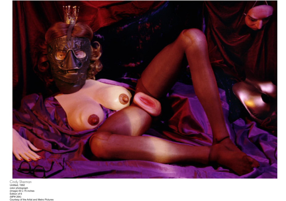
Described by the Pantone Color Institute as a source of creative and spiritual energy, Ultra Violet has an immediate impact, shocking the senses with its visual boldness. It is a forward and futuristic shade of blue-based purple which, since its earliest inception, has been associated with innovative art and design.
The color was first introduced into textiles in the 15th century. A unique and difficult hue to make, the dye was painstakingly harvested from a special gland found specifically in sea snails. Originally a color reserved for the rich and the royal, Ultra Violet has since become an emblem of individuality and ingenuity. Music and fashion icons like Hendrix, Bowie, and Prince strutted boldly in their purple suits, introducing a new and revolutionary approach to sex appeal. Meanwhile, scientists harnessed the power of Ultra Violet light to enrich our bodies with essential benefits like Vitamin D and serotonin. Armed with high-tech cameras, researchers at NASA are finally able to capture never-before-seen images of our vast cosmos, which are surprisingly full of sparkling Ultra Violet stardust.
But what is so eye-catching, so inspiring about Ultra Violent? Pantone’s Executive Director Leatrice Eiseman cites its complexity. According to Eiseman, purple is the “most complex color” because it takes“two seemingly diametrically opposed colors - blue and red - and brings them together to create something new”. This dynamic of taking two disparate parts to form a more complete and perfect whole is one that can and should inspire not just the art and fashion world, but the politics of our everyday life.
This new year opens on a country still mired in polaric distress. But the call to action, unrest, and upheaval is mounting. Now is the time to connect, to innovate, to dare to imagine a better and brighter future, to insist that hope is still possible. In celebration of the evocative depth and emotion of PANTONE 18-3838 and as vanguards of innovation, Musée Magazine looks forward, eager for a promising purple future.


